Wedo
Redesigning Wedo’s Wallet: Simplifying a Complex Financial Tool

Roles
UX Designer
UI Designer
Visual Designer
UX Researcher
Tools
Adobe XD
Google Slides
Microsoft Teams
Miro
Timeline
Mar 2021 - Apr 2021
4 weeks
Overview
Wedo is an app that gives you the power to manage, schedule, host events, stream live, earn in real-time, and send and receive payments with a community to thrive online and offline.
Visit their website at www.wedo.ai
Photo of the UX team (Alice, Hannah, Kelly, & me) with the CMO and Creative Lead of Wedo.
The Problem
Wedo’s wallet feature is one of the most complex features of the app. They offer their users ways to pay and request money through different currencies, allow them to keep track of their bills/invoices, and create payment groups. Before joining their team, the design of the main wallet feature and its onboarding experience was close to completion.
The product was designed without any UX design process, and my challenge was to discover any usability issues with the design flow of the main wallet feature and its onboarding experience.
The Solution
Conduct an audit and usability test on the existing product to discover any critical issues with the original design and redesign the product with the determining issues.
Design Process:
Phase 1: Discovery
Phase 2: Auditing the Existing Product
Phase 3: Usability Testing
Phase 4: Design Recommendations
Phase 5: Redesigns & Final Product
Phase 1: Discovery
User Survey
As my team and I interviewed the stakeholders, we learned they lacked user data and research. One of the things we wanted to provide to the company was more information on our targeted users. My team and I collaboratively created a user survey to help us and the company learn more. We each asked two questions about the feature we were working on. Here is what we learned about the wallet app users:
Survey participants: 30
Competitive Analysis
Before I audited the existing design, I conducted a competitive analysis to help me understand what our competitors are doing and their best practices.
What did we learn from our competitors?
Phase 2: Auditing the Existing Product
Heuristic Analysis
I used Nielsen Norman Group’s 10 usability heuristics for user interface design to help conduct my audit on the existing product. These 10 usability heuristics are the recommended best practices to help create a user-centric design. During my audit, I compared the design to the heuristics and listed any good practices or poor usability. I then scored each item listed with critical issues, normal issues, minor issues, or good practices. Below are the most critical issues and the heuristic violated for the main wallet feature and the onboarding experience.
Source: Nielsen Norman Group
To view the full audit, click here
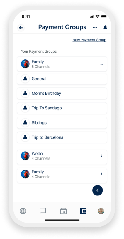
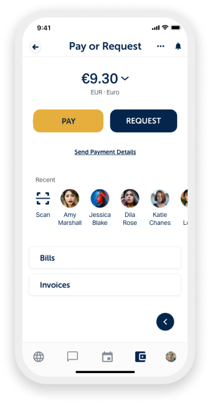
Main Wallet Feature
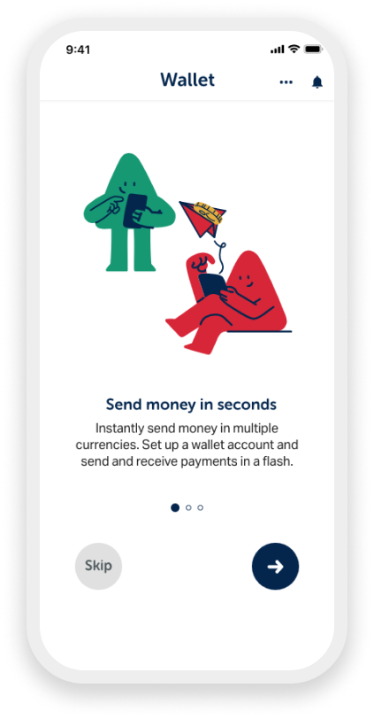
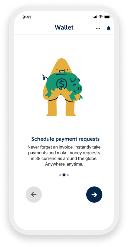
Onboarding & Tutorials
Phase 3: Usability Testing
Wedo is a startup based out of London, UK, and they brought me on board about 1-2 months before their beta launch. I had the opportunity to work with three other UX designers and Wedo’s CEO, CMO, and Creative Lead. The Wedo application had four main features: Wallet, Calendar, Chat & Video Call, and Discovery. The UX team and I decided to take ownership of each feature. I volunteered to work on the most complex feature, the wallet.
The next step was to discover any user issues with the existing product. I conducted five moderated usability tests with each participant through a 30-minute video call. I had each participant walk through the onboarding experience and then explore the main wallet feature. Through this test, I hoped to find any similar issues I had discovered in my audit and any new critical problems I was unaware of.
User testing participants: 5
❓ What am I testing for?
Will the participants abandon the onboarding and tutorials?
Are there any issues with the main wallet flow?
Can the participants identify the different icon buttons and screens?
👍 Positive feedback:
The illustrations are very cute and friendly
UI design is clean and minimal
The colors used on the spent circle stand out
💡 What can be improved?
Onboarding is lengthy and unengaging
Unsure where to press throughout the app
Too many icons are used on the wallet landing page
Phase 4: Design Recommendations
User Flows
To help me better visualize how I may redesign the feature, I created improved flows for the payment and onboarding experience. The user flows helped me stay on track as I sketched and redesigned the high-fidelity screens.
Sketches
Using the improved user flows, I sketched the wallet landing page, payment flow, and onboarding experience flow to help me understand how I want to start redesigning.
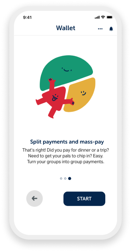
Wallet Landing Page & Payment Flow
Onboarding & Tutorial Flow
Phase 5: Redesigns & Final Product
Style Guide
During our early interview with the stakeholders, my team and I learned they do not have a style guide. One of our goals was to work together and create a style guide to stay consistent throughout the application design. The style guide consists of the company's previously used and new components my team created.
Final Solutions
Reduce the Number of Icons
Call-to-action Buttons
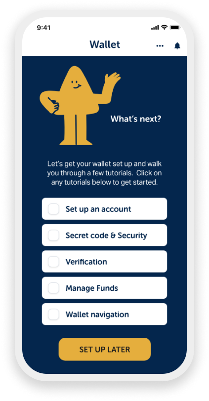
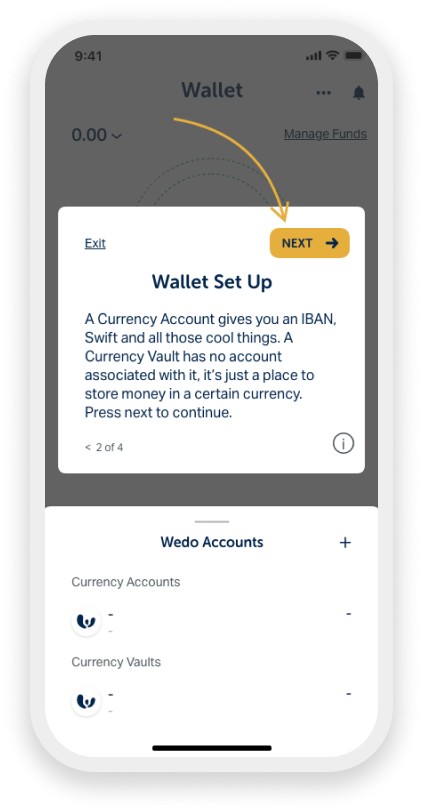
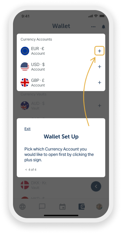
Roadmap of Tutorials
System Status of Tutorials
Clear Tutorial Directions
Final Product


Reflections
The CEO, CMO, and Creative Lead were impressed and grateful for our incredible research, design recommendations, and improved designs. Before we came along, they had no UX team to provide them with the help and resources to measure their product’s user experiences. The best part is knowing how much they learned about human-centered design through our work and presentations.
The beta product will launch in a few weeks, and here are the recommended next steps I presented to the team:
Finalize the design and update the entire feature
Conduct a second round of usability testing to validate the redesigns
Make final changes with the feedback from the second round of usability testing
Launch beta product!
Overall, the experience working with Wedo and the other designers was memorable. On our last day, we were all saddened to go our separate ways but excited to see where we would all end up. I can’t wait to see the beta launch and my design recommendations and redesigns come to life!